80% of the chronic disease deaths occur in the low and middle-income classes in India. Lack of awareness and difficult to access medical facilities considerably increase healthcare costs and reduce life expectancy. This problem is further amplified by false medical beliefs and a lack of proper guidance. Many chronic patients in India want to live healthily and get their conditions under control, but don't know how.
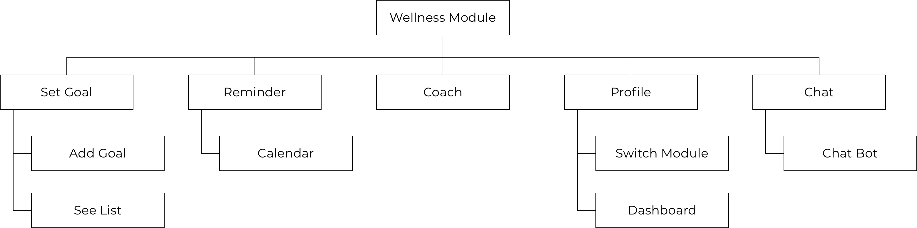
*There are 3 modules in this app: telemedicine, diabetes management, and mental wellness. I only worked on the diabetes management module.
*There are 3 modules in this app: telemedicine, diabetes management, and mental wellness. I only worked on the diabetes management module.
I came in at the design phase and analyzed the prior research conducted with users from India.
The target users of the initial release are middle-class families in urban India. They are college-educated, between the age of 30–45, and have kids. They live a busy life and don’t have a lot of time to cook and exercise. They want to be healthy and keep their chronic conditions under control, but not sure how.
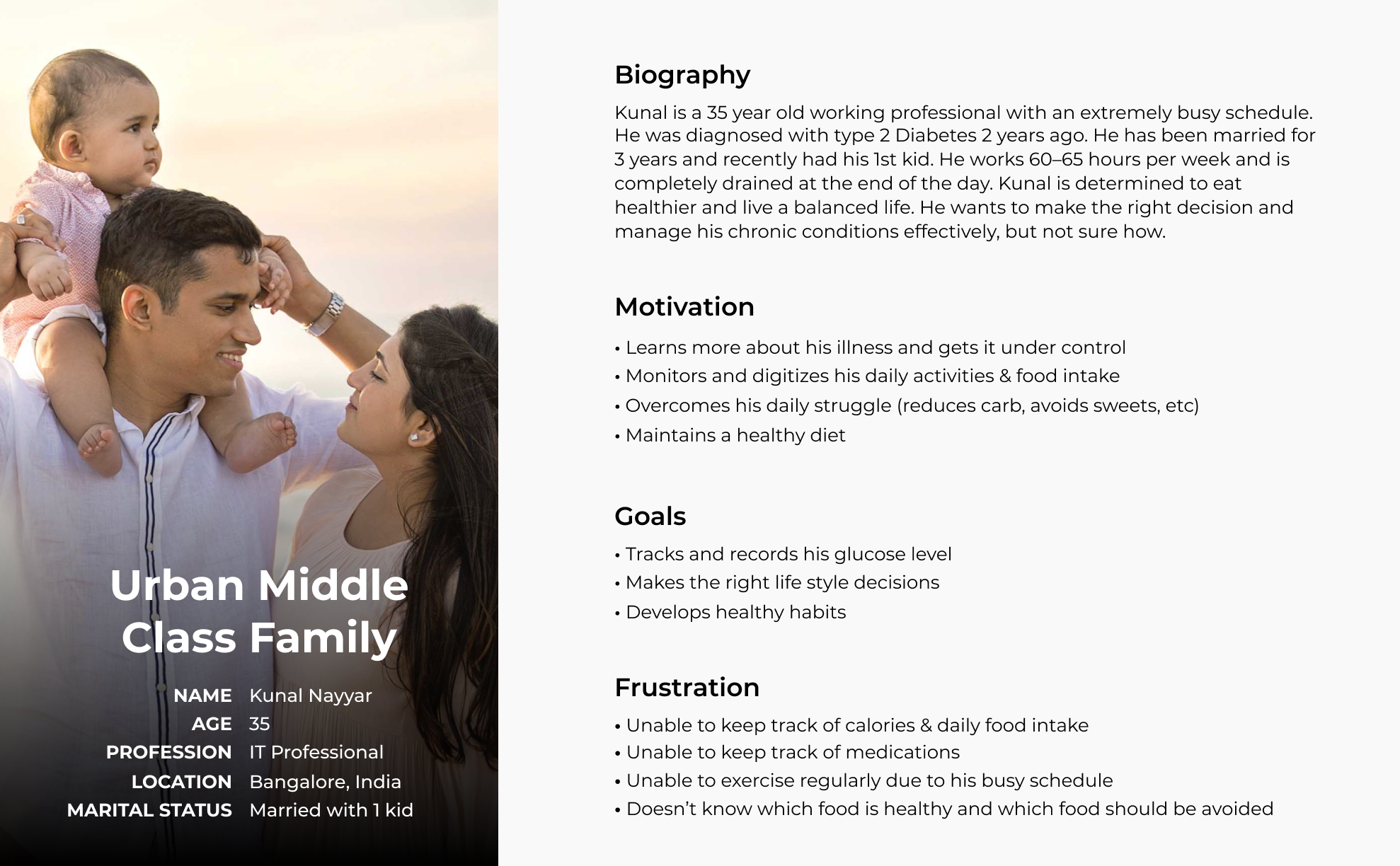
*The content of this persona was provided. I redesigned the graphic layout.
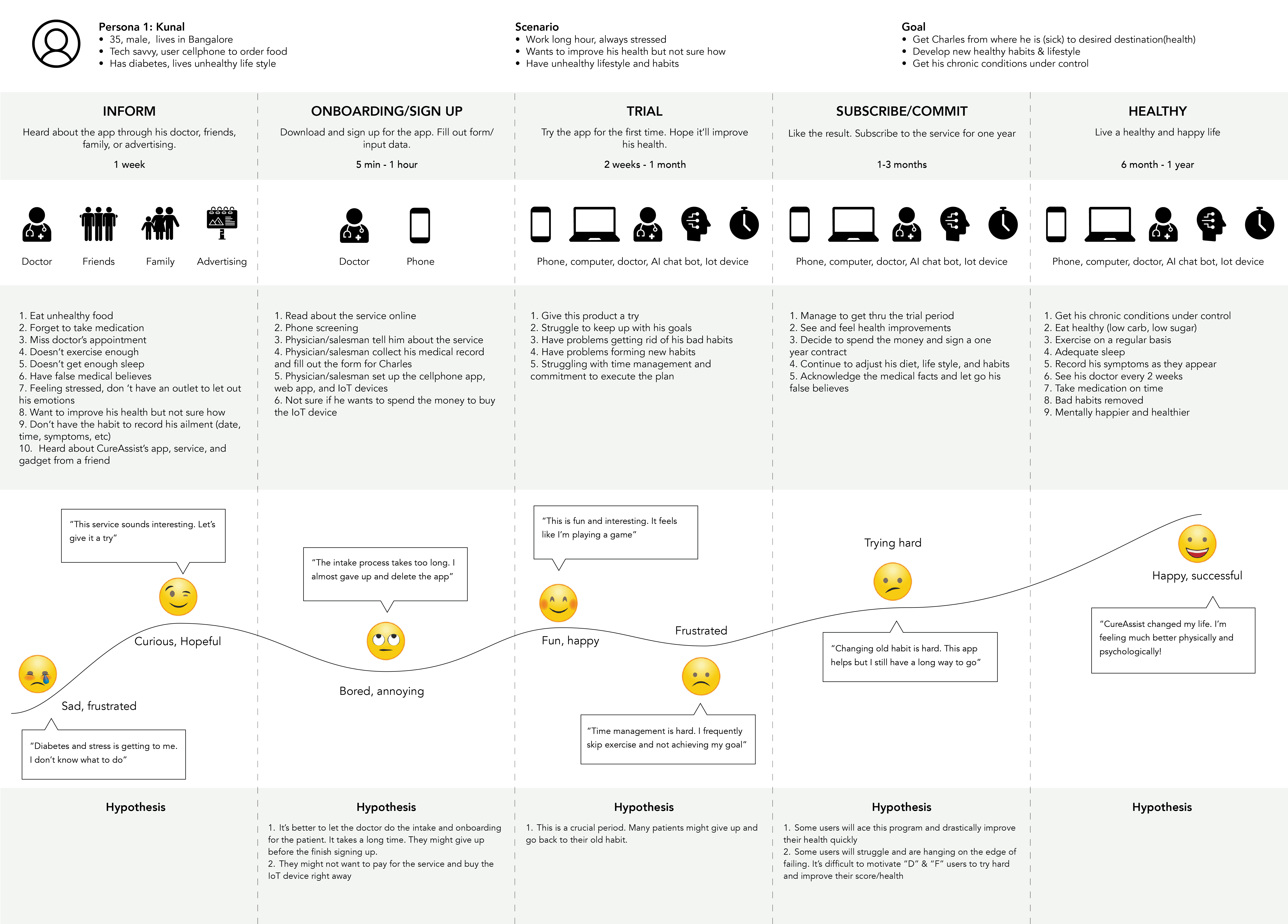
There are five phases in the user journey: inform, onboard, trial, subscribe, and healthy. The on-board and trial phases are the most challenging part of the journey. Many users might give up and not finish the trial. It’s also not easy to change existing habits and start new habits at this age.
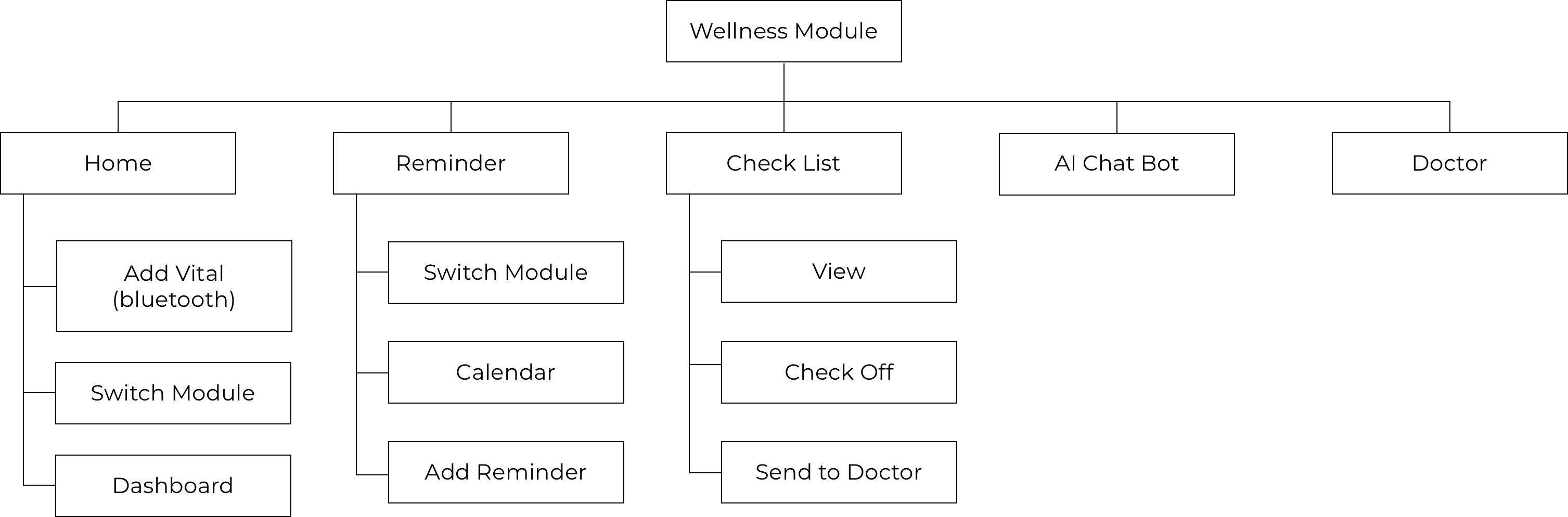
The information architecture changed several times during the design process. We tried a few different placements and did user testing to find out what are the most important features for the users. I place the most frequently used features in the home bar and the least frequent ones in the hamburger menu on top. A floating action button is employed in some screens to quickly add new vital inputs or reminders.
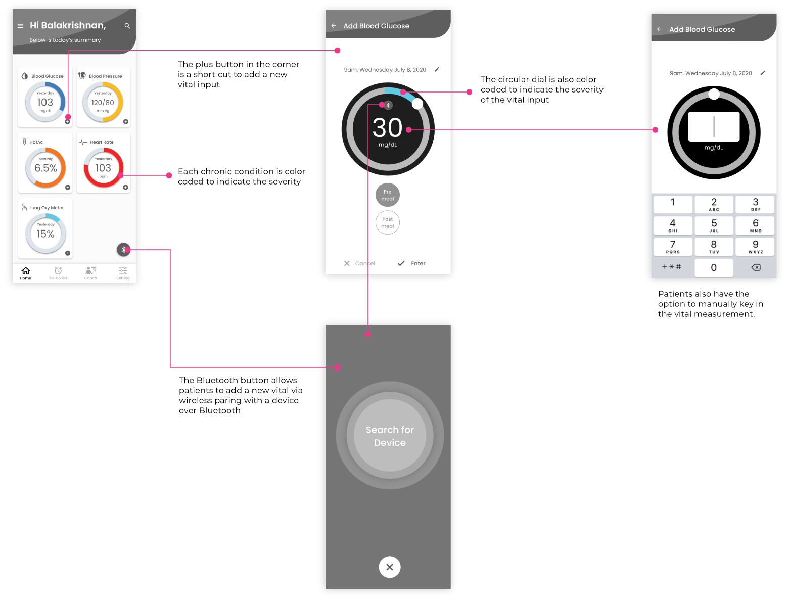
Diabetes patients need to measure and record their blood glucose level several times everyday. Frequent measurements of other vitals such as blood pressure, heart rate allows their doctors to accurately diagnose and treat them. Some vitals can be measured with electronic devices and transmitted via bluetooth.
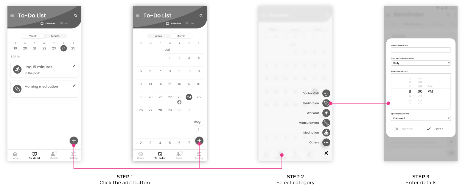
There are 2 ways to add vitals from the home screen. Patients with bluetooth gadgets can add vital by pressing the floating action button with a bluetooth icon. Each vital dashboard has an add button in the corner. Patients can add vitals manually by pressing the add button. If they choose to add manually, they have the option to use the circular dial or manually enter the number with the keypad.
Patients can add a new vital input by pressing the floating action button in the vital detail with the plus icon.
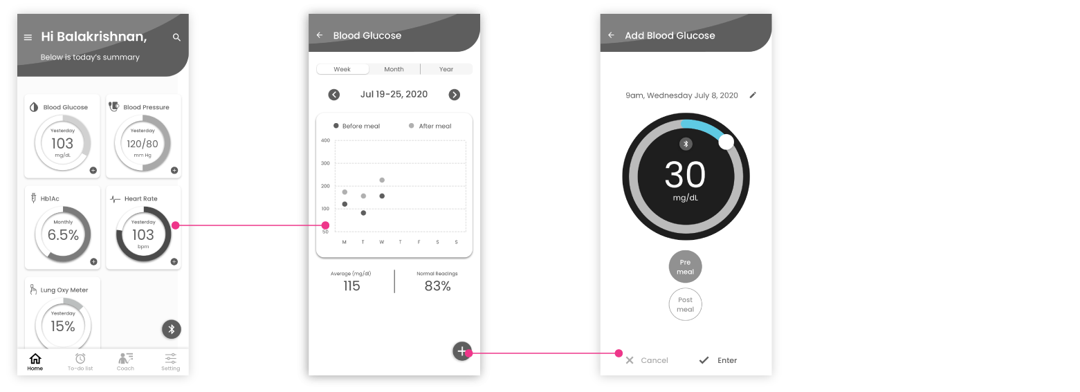
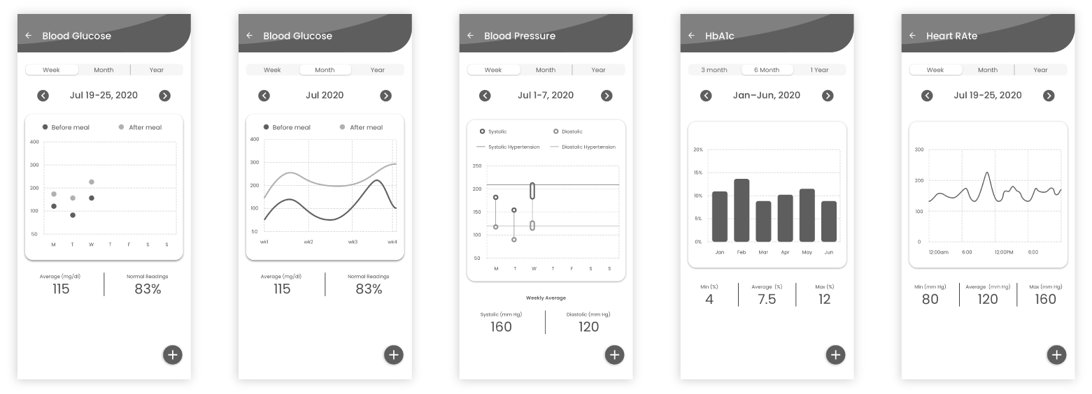
In the vital detail page, data are visualized in graphic format for ease of reading. Several visualization techniques (dot graph, sign graph, candle stick, bar graph, etc) are employed to visualize the information.
In the to-do list tab, patients can add reminders to remind themselves to perform their daily routines, such as exercise, take medication, measure vital input, meditate, and others. Alarm and vibration will go off to remind them at the designated time slots.
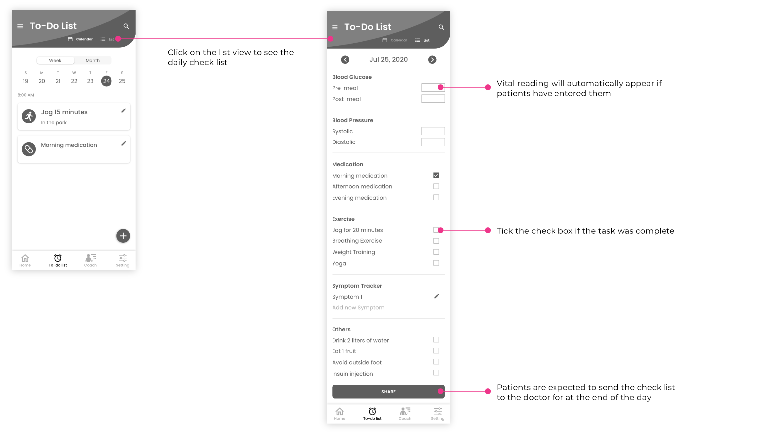
Patients can access their daily checklist in the to-do list tab. They can toggle between the calendar view and list view on top. Vitals will automatically appear if they have added new inputs. They are expected to check off routine tasks they completed and send the result to their physicians at the end of the day everyday.
After multiple rounds of iterations, the UI below made the most sense to me and my project manager. I tried to make adding new vital inputs as quick, easy, and accessible as possible. The most important goals are visualizing the patient's chronic conditions and providing tools to help them develop healthy habits.
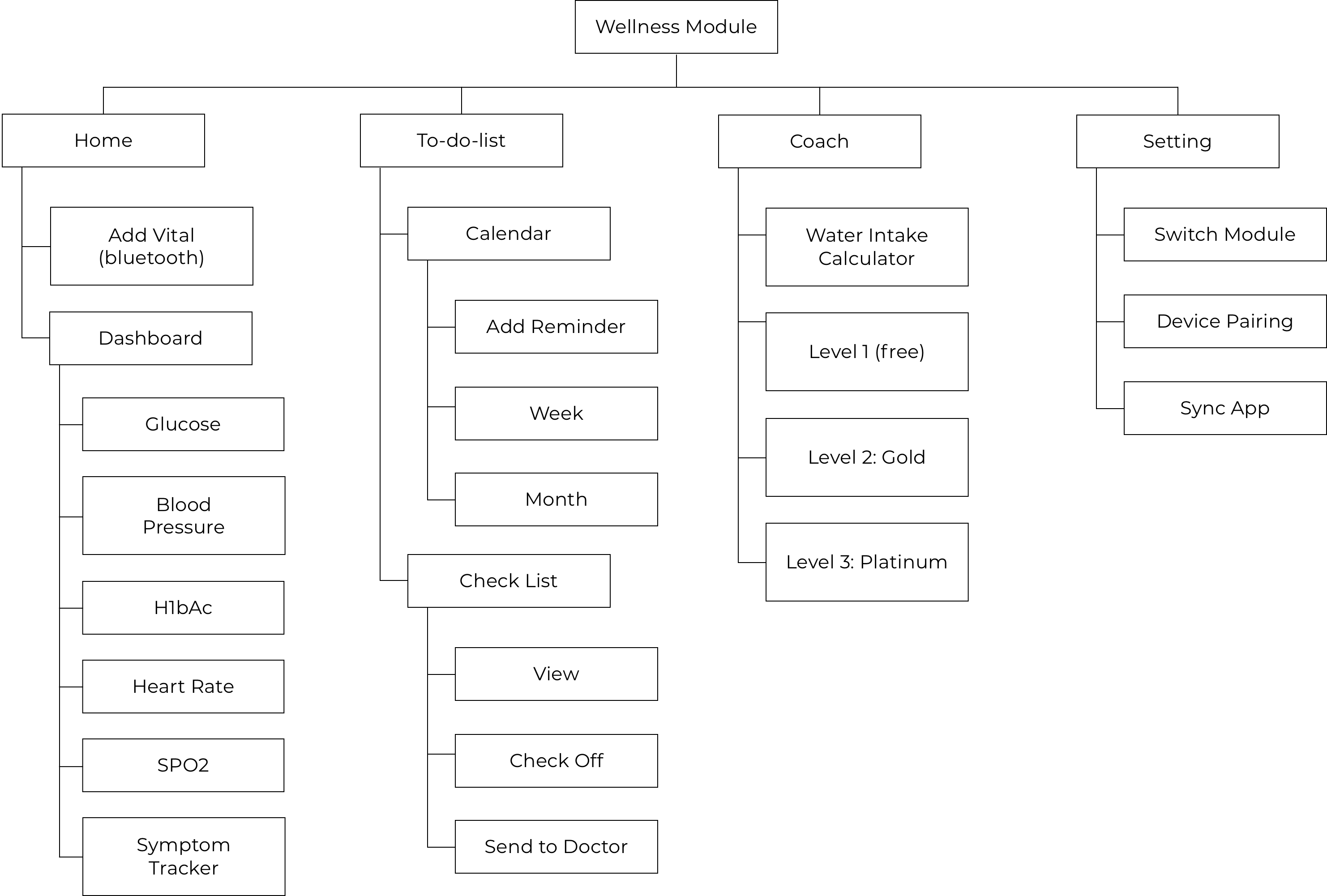
There are 4 main menus in the home bar: home, to-do list, coach, and setting. The home screen consists of dashboards that visualize patients’ chronic conditions with graphs. There is a floating action button in the home and to-do list tabs for patients to quickly add new vital inputs or reminders. Patients can access the telemedicine and mental wellness module in the setting tab. The least accessed features such as language setting, user profile, and help menu are nested in the hamburger menu on top.
The home screen dashboard gives the patient an overview of the average vital readings. Each chart is color-coded to alert users if their vitals are too high or too low. White is safe, yellow is slightly over, orange is high, red is very high. They can click on each dashboard to get more details of their chronic conditions. In the detail page, there is a tab on top for them to select and view their average vital reading over a period of time (day, week, month, 3 months, year, etc). The unit varies. They can also click on a specific day or hour to view their vital input at that specific time slot.
Patients can click on each category in the dashboard to access detailed statistics and data visualization of their vital progression such as blood glucose level, blood pressure, HbA1c, and the like. They can add new vital readings by clicking the floating action button with the plus sign. They can adjust the value with the circular dial or by clicking the bluetooth button to get the measurement from the device over bluetooth . They also have the option to manually enter in the value with the keypad.
To-do list allows users to set reminders to remind them performing their wellness routines such as taking medication, exercise, measuring vitals, and meditation. They can toggle back and forth between weekly and monthly views with the tab on top. The monthly view shows when do their prescriptions expire, which days did they exercise, and their next doctor’s appointment. Patients can also go into the list view to send the vital readings to their doctors.
Patients are expected to submit their daily checklist to their doctors at the end of the day everyday. They can check off tasks they completed in the calendar view or in the list view under the to-do list tab. The submission button is inside the list view under the to-do list tab. Doing this gives the doctor a complete log of the patients’ diet, medication, water intake, exercise, vital inputs, and symptoms on a day to day basis. This allows doctors to accurately diagnose and give recommendations to assist patients to control their chronic conditions.
Last summer I completed the MVP of the home, to-do list, and setting sections of the diabetes management module. The coaching section was on its way to completion. I created a style guide/hand off for the next designer who was going to take over this project. The final result was well received by the Founder and CTO. Further quantitative data is required to prove the success of my design solution. It'll be available later this year after the app is launched.
Several sprint cycles will be executed in the coming months to improve and maximize the performance of this app. In the MVP we are only providing patients with basic tools to monitor and manage their chronic conditions. The company wants to gamify the experience and make the process more fun in the future.

